Photo Essay
How to make posters with an 80-year-old letterpress machine
Graphic designer Laura MacDonald uses old techniques to make new posters
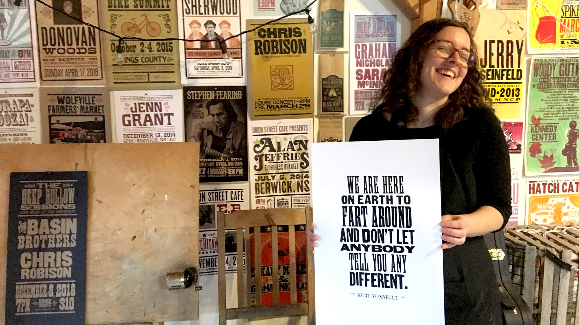
caption
Laura MacDonald makes letterpress posters from her home studio near Kentville, N.S.Laura MacDonald can make a poster from scratch — and she doesn’t need a computer or electricity.
MacDonald is owner and operator of Deep Hollow Print, a letterpress print shop she runs out of her home near Kentville.
On Nov. 14 she worked on posters featuring a Kurt Vonnegut quote to be sold at shops in the area.
From start to finish, the printing process takes just over two hours.
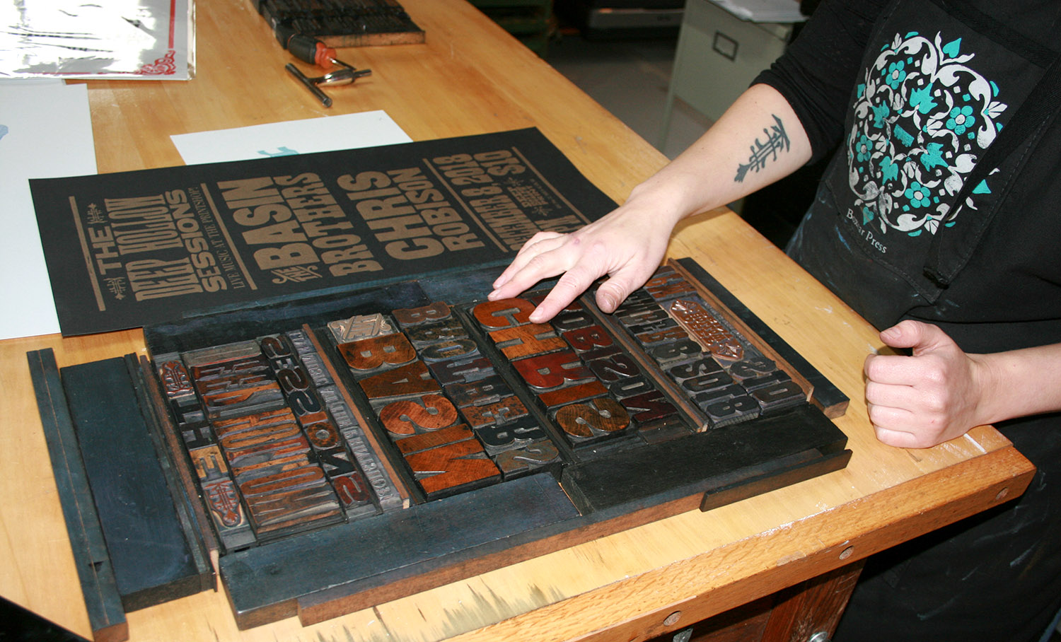
caption
Letterpress type is inversed so that the paper is printed with the mirror image of each letter.Letterpress is a form of printing where movable type or engravings are arranged on the bed of a printer. They are then rolled with ink and pressed onto paper to create an impression. From its invention in the 15th century, through to the beginning of the 20th century, the letterpress was the primary way to print books and newspapers.
It has been replaced by more efficient methods of printing in the last century, but has seen a revival with artisans like MacDonald. At 32, she has been using the press for five years and says she likes how it creates a handmade feel to the prints.
While working on the signs, MacDonald searches through her cabinets for wooden letters. Each individual letter is laid out in reverse order on the table, before being moved to the press.
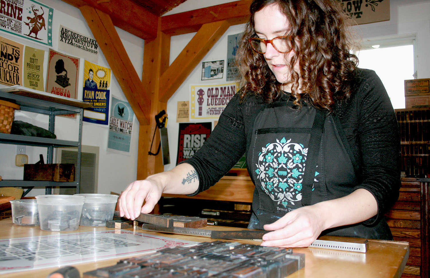
caption
MacDonald begins to measure the sentences she needs to lay out.The tools MacDonald uses, like the letters, are old and hard to come by. A shop in New York makes replacement letters but, she says, she doesn’t like the way they print.
“The antique stuff is way better,” she says.
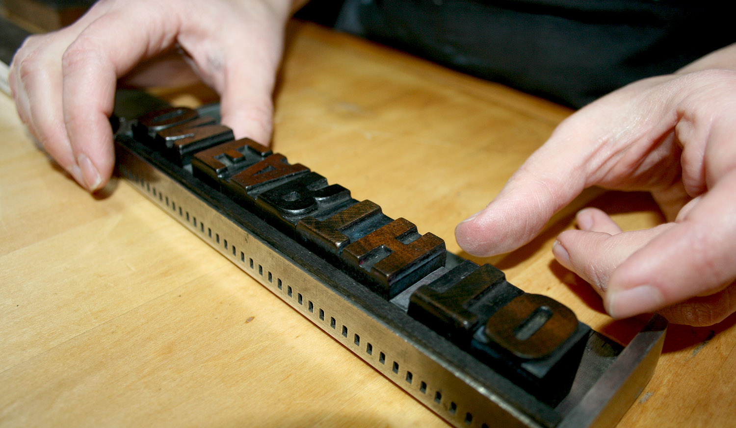
caption
Letters are laid out one by one in reverse order.As she lays out the letters in reverse order, she points out she no longer has the letter d in the typeface she is using. So, she has to use a slightly thicker one. It gives the poster an imperfect look, she says, but people come to expect that in handmade things.
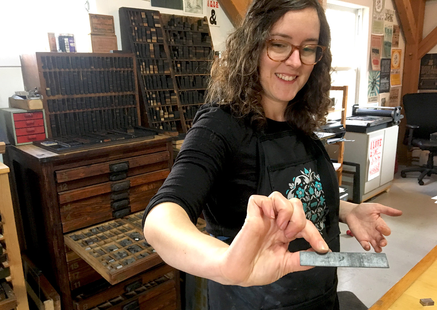
caption
MacDonald finds the right thickness of lead to space each letter.She inserts small pieces of lead between the letters to create space after laying them on the table. This is how letter spacing in typography came to be known as “leading,” she says.
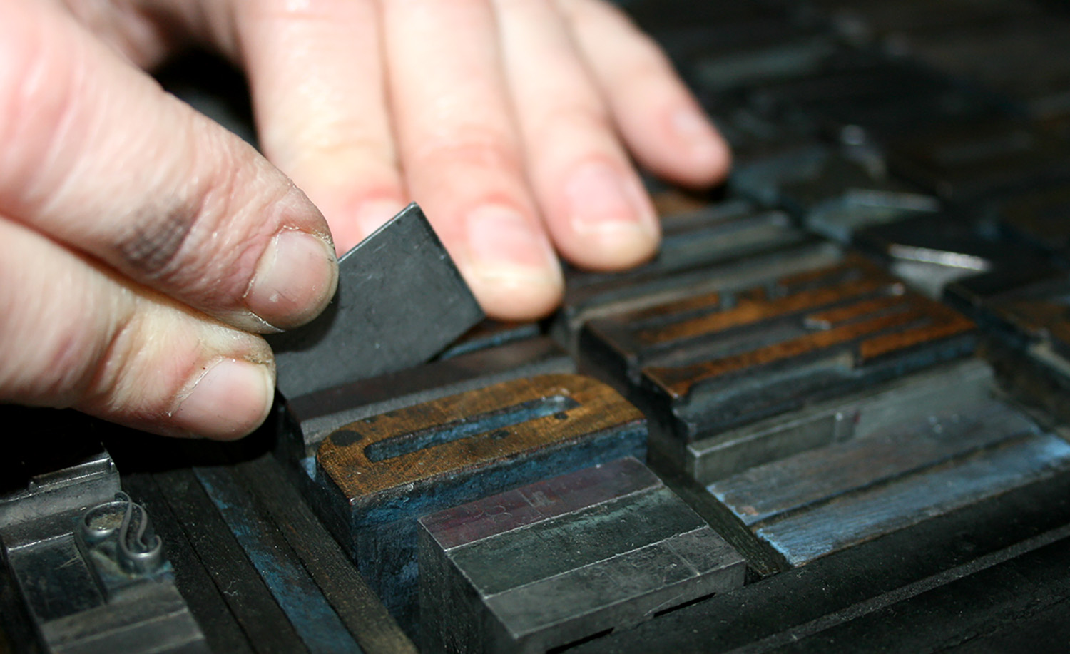
caption
Lead spacers are needed when some letters are too thin or close together.“When I do digital design, I’m trying to make it look more letterpress,” she says. “But when I’m doing letterpress, I’m trying to make it look as perfect as possible.”
She has a few sets of small metal type, the kind used to produce newspapers, but prefers her obsolete collection of big, clunky fonts.
“I’m big and bold and woody,” she says with a laugh.
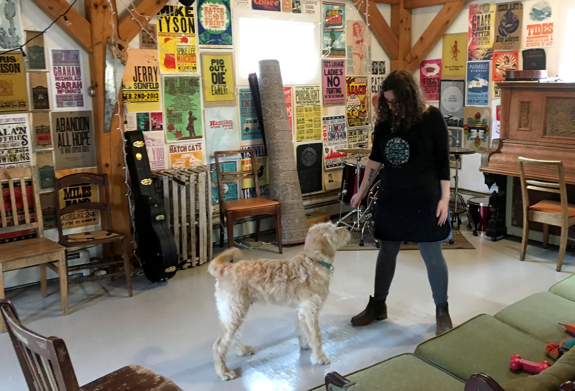
caption
MacDonald shares her studio with four-month-old Levon, her untrained intern.Once the letters are set, she transfers them to the letterpress machine’s bed and spreads ink on the rollers.
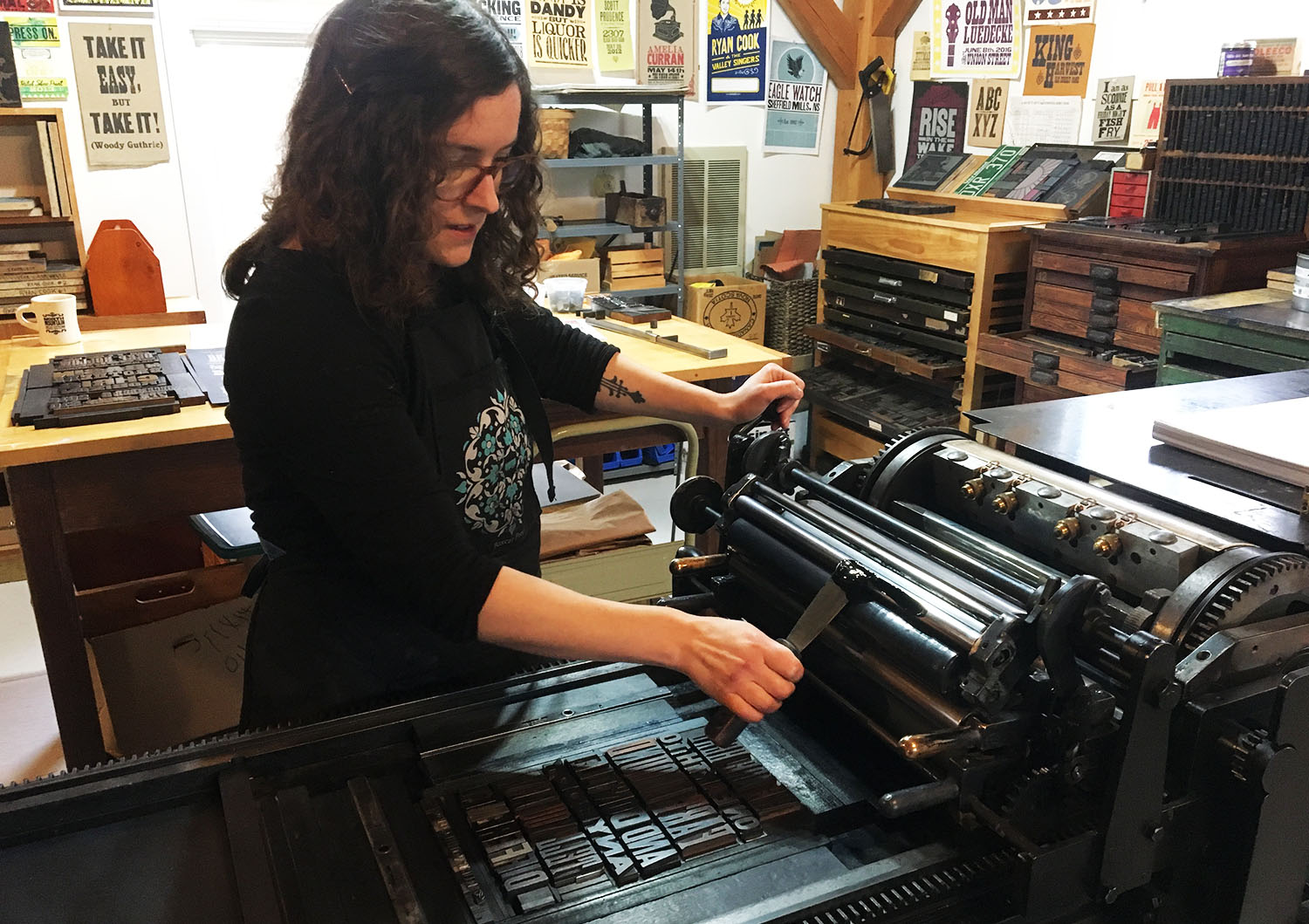
caption
Black ink is spread on the rollers of the machine and then distributed over the letters.“Vandercook presses are kind of the gold standard for this kind of work,” says MacDonald of the two-metre, 1,200-lb machine in her shop. Popular in the 1930s, she says this rare model was one of the last machines made before they became motor operated.
When the ink has been applied to the letters, MacDonald feeds a test paper into the rollers and cranks it through by hand.
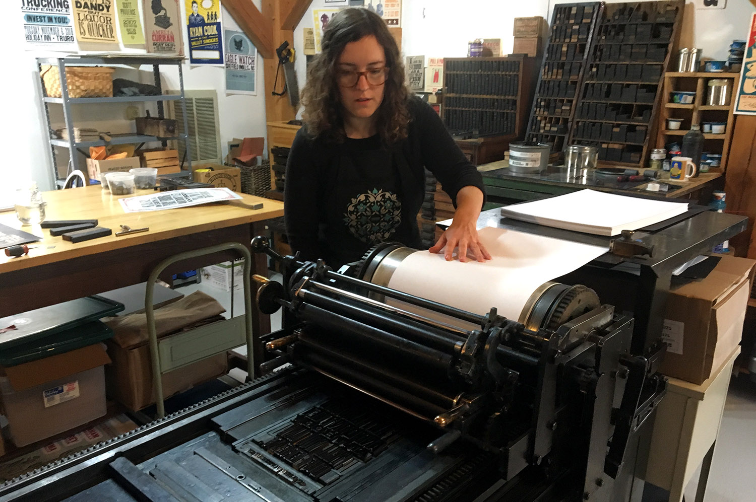
caption
Paper is fed through the rollers when the ink is fresh.
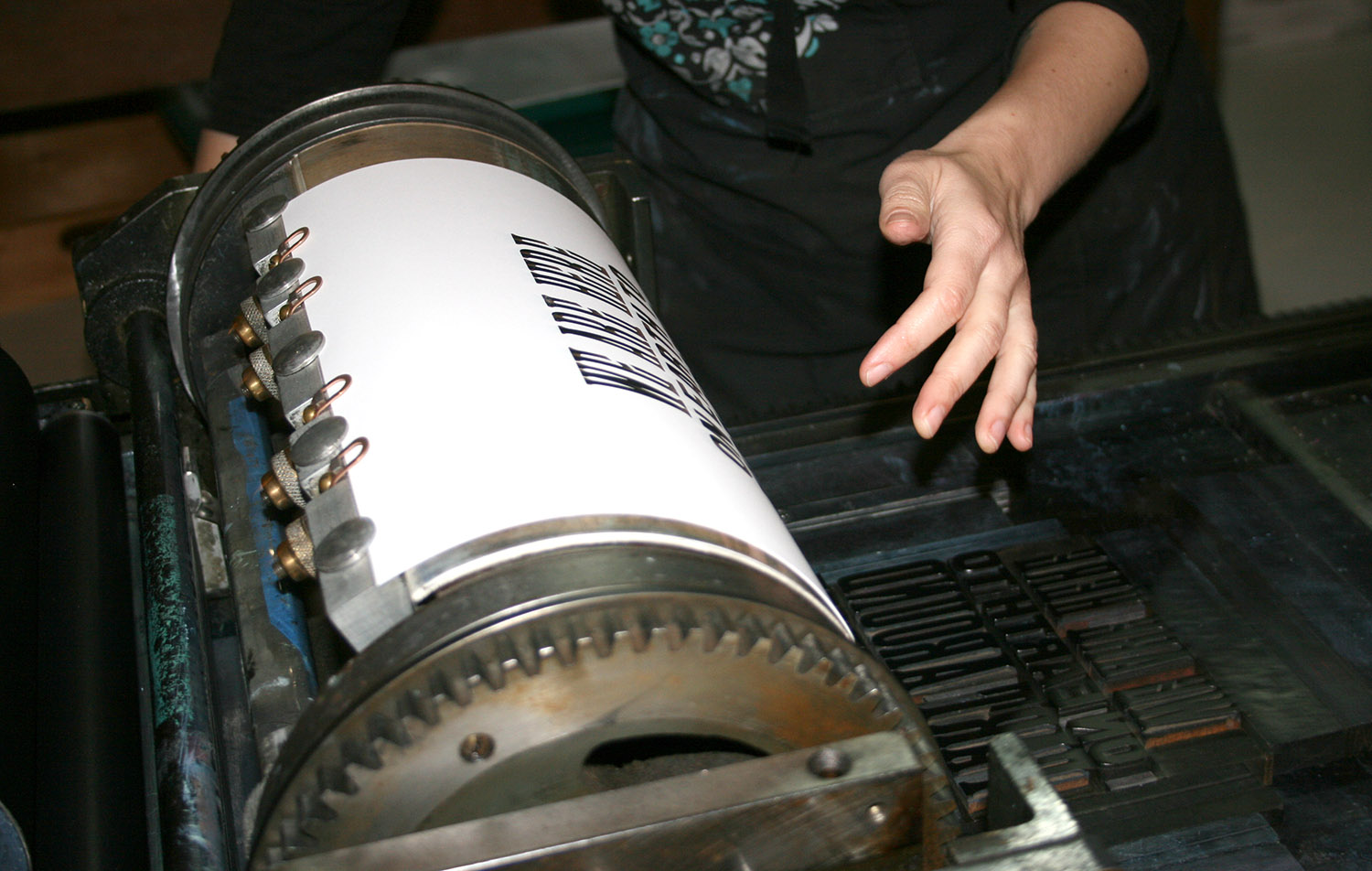
caption
In one fluid movement, the rollers reveal the paper after being pressed into the letters.The letters are then pressed onto the paper. When she cranks it back, the sheet emerges with the quote: “We were put here to fart around and don’t let anybody tell you any different,” printed clearly in the centre.
MacDonald holds up the print for inspection. She tweaks a few details and adds and removes a few millimetres of leading, until she is happy.
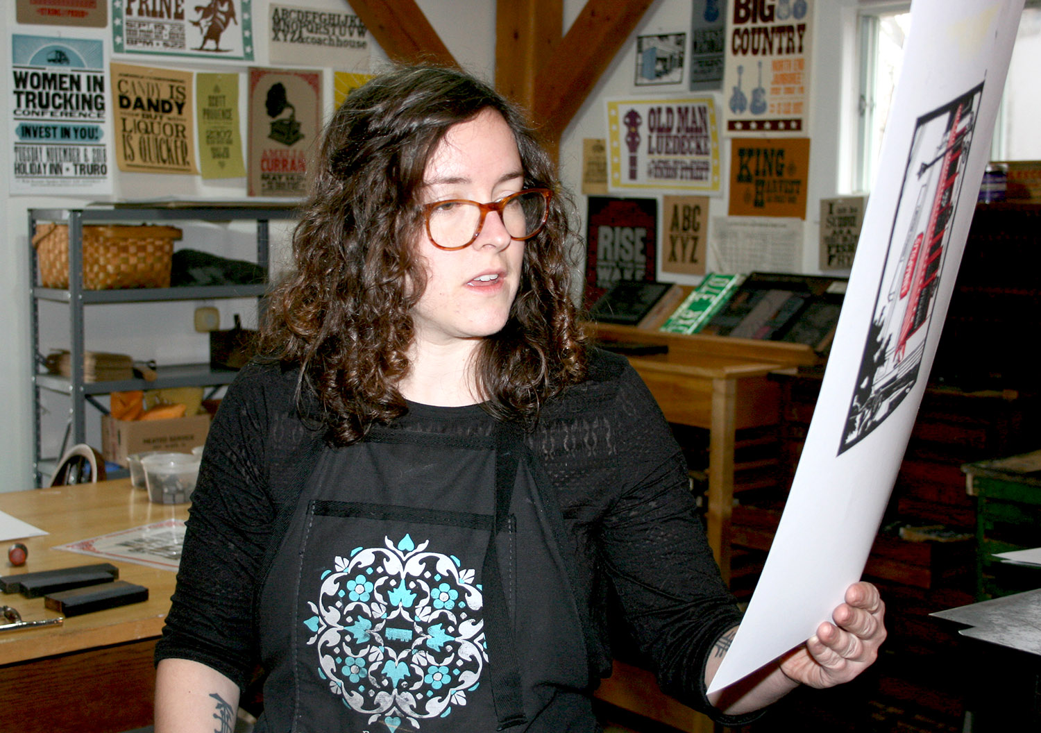
caption
MacDonald does her test prints on scrap paper.She says learning how to print helped her understand the rules of digital design in Photoshop.
“The basis of typography comes from what you can and can’t do on a press,” she says.
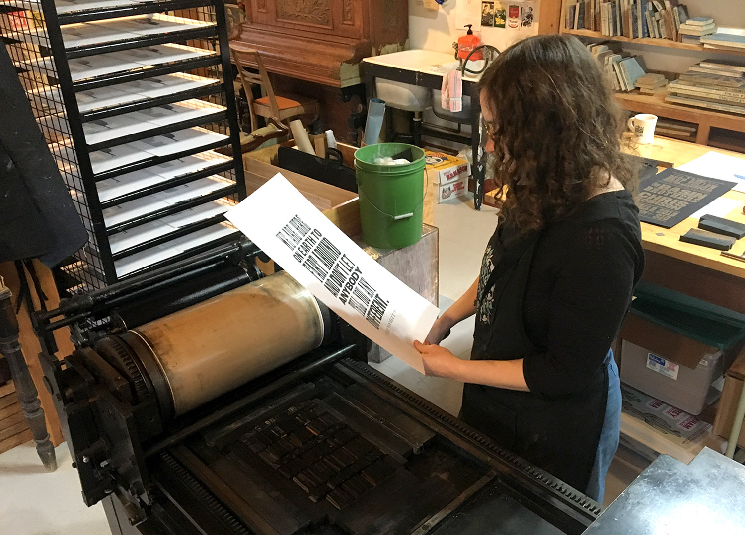
caption
She checks and makes sure every letter is in the right place and has enough ink.After five or six tests she’s ready for the real prints. Once these are done, she lays them out to dry.
Christmas is her busiest season, but MacDonald works throughout the year making event posters for local bands. In 2016 and 2017 she received the East Coast Music Award for Graphic/Media Artist of the Year.
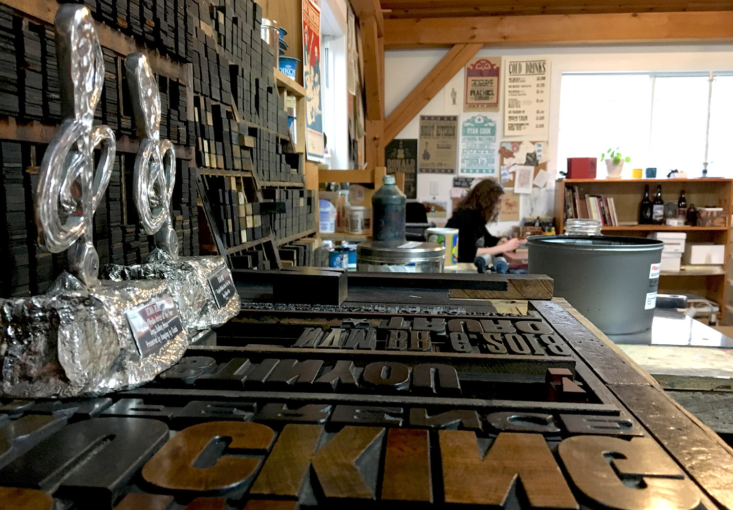
caption
MacDonald’s two East Coast Music Awards stand out as the shiniest items in her studio.Deep Hollow Print will be one of the exhibitors at the Halifax Crafters Society Winter Market this weekend.

