New digital parking stations confuse Haligonians, but city says changes on the way
The Halifax municipality has been receiving complaints around user interface issues

caption
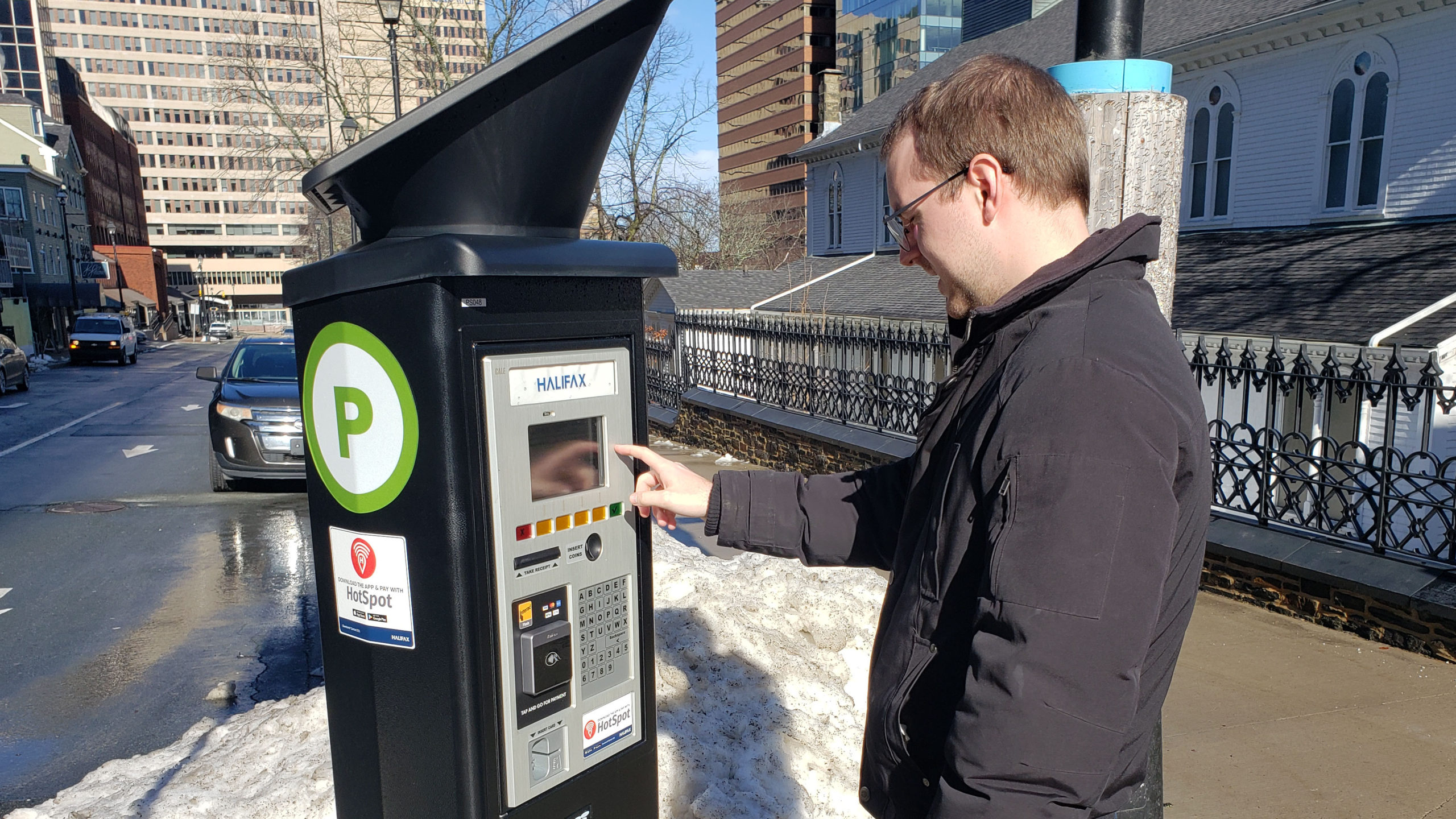
A man uses one of the digital parking stations in downtown Halifax on Feb. 3, 2020.Longtime Halifax resident Shirley Tillotson had to start over several times before she could figure out how to get one of the new parking stations to work.
“It was frustrating and annoying,” said Tillotson.
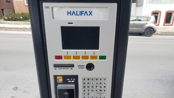
She said the buttons to move to the next screen were not always the same, or in the same location. There would be a key under a tab, then a button that says ‘next,’ or a checkmark — each time signalling the action to proceed.
“At each point you’re asked for the same thing, but there’s different keys now,” said Tillotson.
Tillotson is not alone in her frustration around the new parking stations that were first rolled out in August.
Davis McPhee is a software developer at computer consulting firm Garvin-Allen Solutions, and works with user interface (UI) design. The Signal reached McPhee for comment on the parking stations.
He said the current model would “definitely cause some confusion.”
McPhee said common practice in UI design is to make mock-ups of layouts in Photoshop, and have users test them before even beginning development on the software.
“That way you’re working much less on assumption about how a user interface would work, and more on data about how they do,” said McPhee.
McPhee said working with users every step of the way is key.

caption
Halifax residents have complained about the layout of the parking stations user interface.The city says they have listened to the feedback, and will be implementing changes.
Victoria Horne, manager of parking services for the Halifax Regional Municipality, said they have been receiving complaints since the initial rollout in August.
She said the contractor had provided a best-practices informed screen sequence, which saw success in other jurisdictions.
“The interesting thing is it’s just not working here,” she said.
Horne said the city plans to continue to work with the contractor, Precise ParkLink, on changes to the parking station’s UI as more user feedback comes in.
These tweaks are all free of charge under the city’s agreement with the contractor, Horne said.
Regional council had approved a $4.5-million budget for the project, which Horne noted is “on time and under budget.”
She cited the COVID-19 pandemic as a contributing factor in the issues people are having.
“We had no street teams of staff and volunteers who would walk people through the use of the stations,” she said.
However, Horne said that because of the pandemic the rollout was also possibly less bumpy than it may have otherwise. Smaller crowds and fewer tourists meant that issues were experienced on a smaller scale, she said, making for a smoother transition.
In the meantime, as changes are made to the UI design of the stations, the city has upped its 311 resources for user issues. They are also working towards installing a step-by-step guide on the stations themselves.
About the author
Nathan Horne
Nathan Horne is a journalist interested in breaking stories that highlight the inequalities and injustices in society.

D
Dale
D
Debra M Boutilier
J
Jimmy
T
Todd
T
Tyson